Duration
3 weeks of a 10 week course
My Role
Project Management
Information Architecture
Content Strategy
Team
Michelle Craigen
Yumiko Murray
Joshua Sera
Design Brief
This was our client project at General Assembly. This meant we’d be meeting with, and working for real-world clients and we were expected to deliver on real client needs. In this case, we were assigned to work with The University of Washington Bothell’s Academic Affairs team. Their website is a critical site, and they needed a lot of Information Architecture help.
Project Challenge
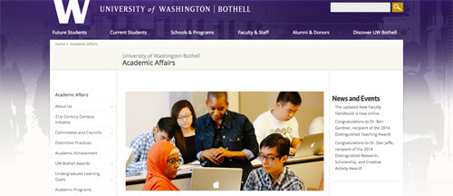
The UWB’s Academic Affairs site in a centralized place for faculty to find information relating to their job, such as tenure and academic policies, as well as a place for prospective faculty to learn about what sets UWB apart from other universities. It serves the purpose both as a marketing site, and as an information storehouse.
Client Meeting
The first thing we did was to have a client meeting. A group from UWB came down to the GA campus, and we had an hourlong meeting. During this meeting, I took notes, nailed down what the client wanted, and came out with a plan, a list of dependencies from the client, and a list of deliverables due by the end of the project.
UWB has experienced rapid growth, and their Academic Affairs site has grown organically, without much oversight, or long-term planning. From this, I decided that two of the deliverables should be a content audit of their site, as well as a sitemap, to give a broad view of how their site should be re-organized.
User Research
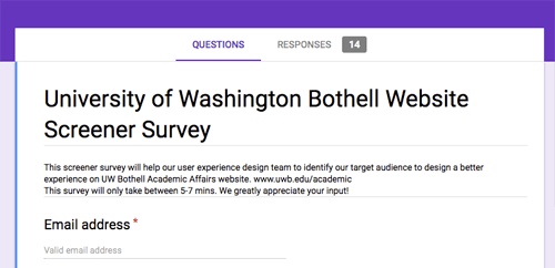
As a team, we came up with a set of user research questions, in order to figure out what people used the site for. According to the client, the site was intended for faculty and prospective foremost, so we tried to get as many faculty members as we could. This proved to be a bit more difficult than we expected. We were provided a list of faculty, staff, and students that we could email for research purposes, so we created a screener survey using Google Forms and sent it out.
A day went by, and we got no responses, but at the end of the day, we did get an email from the client informing us that a few people had emailed them warning about a phishing scam that was going around. We’d been mistaken for scammers! I immediately wrote an email apologizing, and explaining the situation, and had the client send it out to everyone, to make sure it came from a trusted source. We were finally able to get 14 responses, which gave us a pool of people to interview, and gave us a baseline for how easy the current site is to use.
Content Strategy
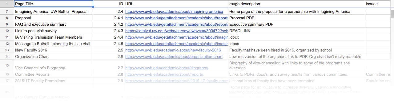
While waiting for Michelle’s user interviews to be completed, I took a tour of the site itself. I started a content inventory spreadsheet, which meant visiting every single page in the site, and marking down it’s title and URL, then giving it an ID representing its’ place in the site hierarchy, making a note of all components, and linked PDFs or .docx files linked on the page, then lastly making note of any issues. It was suggested that I should use an automated tool to crawl the site first, but the information on the academic affairs site is scattered over the rest of the UWB site, as well as the main University of Washington site that the job of determining what was and wasn’t actually part of the Academic Affairs site was more complex than I had time for. Ultimately, I had to inventory 106 pages total, which is actually on the trivial side for content inventories.
Initial content inventory (Google Sheets)Generating a site map
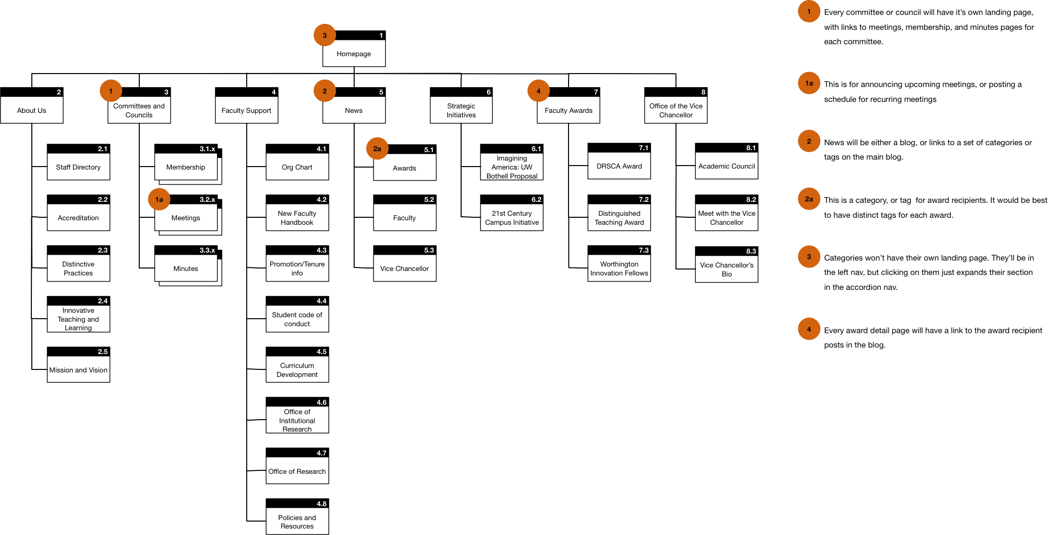
From the user interviews, we did an affinity mapping exercise, which allowed us to get an idea of the categories of information that people visited the site to find. I used this to generate a site map that cut the number of top-level categories down to 7, from 17.
An important step to making a site navigable is making sure the user can form a mental model of how the site is structured. It’s accepted at this point that we can keep about seven (plus or minus two) things in short-term memory at any given time, which means we should limit the number of items at any given level of the site to around that number.
Site map (PNG, 185k)Updated Content Inventory
Now that I had a good site structure, I dove into the task of updating the content inventory. I added these new fields:
- New URL
- keep/edit/delete
- New Category
The new URL would be the URL that the content in question would move to. The client would set up redirects from the old URL to the new URL to ensure links from other sites and bookmarks would continue to work. Keep/edit/delete would let the client know whether the page needed edits, or would just be deleted, and new category would let the client know where in the navigation hierarchy the page would live.
Updated content inventory (Google Sheets)Home Page Redesign
In parallel with my content strategy work, Yumiko did a redesign of the home page, to highlight the parts of the site that user research showed to be most important. This helped people find the information they wanted quickly, by presenting it immediately.
Results
We tested the redesigned site with four classmates, which went well, but we found that our testers wanted to see more up-front content, so Yumi redesigned the home page to make that content more obvious.
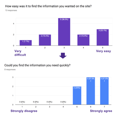
Finally we tested an InVision prototype remotely with faculty at UWB. We sent along a list of tasks for them to complete, and a survey to fill out afterwards. All testers were able to complete all tasks, and they were able to find information much more easily than they were before.
Opinions on how well the site would serve first-time users were still split, and if we’d had more time, we would have liked to have addressed this in a better way.
Next Steps
A part of Content Strategy is governance, meaning what sorts of standards and procedures you create to ensure how content is added in the future. I gave the client some ideas on how to maintain their site going forward, such as requiring committees to provide a standard set of information by a certain date in order to be listed on the committees and councils page, setting up calendar alerts so the person in charge of maintaining the site would know when to update curriculum development guidelines, and moving certain types of content to a blog to make categorization easier. Additionally, we talked about a responsive redesign of the site to make navigation easier for users on mobile devices.
Metrics
If we had time, an interesting metric to measure would have been the distribution of visits across this site. Currently, out of all the pages within the Academic Affairs site, only a few receive any real traffic, with about half having received less than 10 hits over the last month. A measure of success would be that the distribution of hits over the Academic Affairs site would become more even, meaning that both the content itself was more relevant, and that the site itself made finding that content easier. Content receiving no hits over a long period of time would be deleted.
Summary
Reaction to our work, and the presentation was very positive. The client appreciated that we were able to do work that had been overdue for quite awhile in a short amount of time, and that we were able to deliver on what we’d promised in the original client meeting.
Final client presentation slide deck (Google Slides)ontact
- me@joshsera.com
- linkedin.com/in/joshsera
- ©2017 Joshua Sera, Seattle, WA